Showing posts with label SPP. Show all posts

Tuesday, 24 February 2009

Journal Task: Research

In the past few years the purpose of my creativity has been to build on what I can do and explore different areas of deigns as well as determining the technical level of my creativity and discovering what drives and influences my ideas. It’s constantly building and will always be so that I can get to a higher level of creativity.

It has been for myself, but also for my peers and educators. Myself because I need to be able to be creative to a minimum level, which I feel I am, but I need to understand what needs to be done to be at that level in terms of technique and method. My peers because they can look at what I have created and give me feedback and suggestions. My educators because they have made the decisions to let me progress as far as I already have, and there will always be someone to decide whether my creativity is at a good enough level, after educators there will be businesses and people from the real world.

When I have created work in the past I put it through stages of selection, which involve all of the groups that I say my creativity has been for. First of all I select various versions of a final piece, all of which are in the later stages of design. Then I pass them onto peers and educators for feedback, obviously I get a variety because of the difference between peers and educators so I have to determine which of the feedback I’m likely to incorporate into the final version. It’s likely that I use feedback in most of my final versions, but I will not use it to an extent that it would effectively change a design, so I would say that when creating my work the decisions I make are my own, but in some circumstances they are influenced by groups, but they have to be - if a product were created without first prototyping it, its likely to have flaws which the audience do not want.

What do I want the future of my creativity to be? I suppose I want it to be something that’s very broad and constantly growing, and of course I want it to have the involvement of various groups because this helps to broaden ideas and technique.

Research can help me get to the point I want to be at because I feel it is the basis of any idea, and therefore of my own creativity. For example, before I starting drawing sketches for my logo’s, I first looked at existing ones, but specifically I looked at tribal designs, I.e. tattoo’s because I knew that one of my designs was going to have a tribal theme to it.

When first starting research I like to use the exploratory method because it’s the best way to look at a lot of information and compile it without actually knowing specifically what to look at. However, it’s not my favourite, I find Interim to be the most useful. Once I know what I’m specifically looking for I use a web-based application called StumbleUpon. It’s an application which allows it’s users to ‘stumble upon’ new things which they have specified a category for and save the pages to come back to after gathering enough - I.e. if you select a category such as Arts, then there are subcategories such as drawings, which I have used to look at character sketches to try and initiate ideas for my avatar.

I do not really feel very weary of any of the methods, nor do I find any of them irrelevant, I feel they all play their part, there’s a point in a project in which each of the research methods could be used.

Wednesday, 28 January 2009

SPP: Metropolis

Fisrt things first.. what a bloody long film! Righto, few things to talk about with this one.

The films tagline: 'There can be no understanding between the hands and the brain unless the heart acts as a mediator.' - this message was reapeated throughout the film at different points, and until close to the end of the film it didn't make perfect sense. I liked this because it kept me guessing, and when I did realise what it ment I was chuffed. The Hand, Brain and Mediator were represented through different characters, and different social classes. The hands were clearly the working class, the brain was Joh Fredersen who was the creator of metrolpoils and clearly of a higher stature than the rest of the characters, and the heart was Freder, the son of Joh Fredersen, his role clearly being to connect the two groups.

Aparantly the film shows technology in a rather tainted light, almost showing it as evil. I would agree to some extent as there is an evil robot, and the fact that Metropolis is run by machinary and technology means that the 'Hands' are constantly forced to work to support it, they're almost slaves. However, there are flaws with naming the technology as evil I feel - the technology itself isn't, it's the way that the characters use it, i.e. the evil robot doesn't have it's own will, it does that of Rotwang (the inventor). The 'Hands' may feel forced to keep the machinary running, but they are dependant on it and they need it as much as it needs them. This is more clearly shown after the workers destroy the machines.

Well that's it for now, if anyone didn't get the names of the films that Julius suggested they are:

Tetsuo: The Iron Man (1989)
Testuo II: Bodyhammer (1991)

Both films are by Shinya Tsukamoto

Monday, 26 January 2009

SPP: The Cabinet of Dr Caligari


We watched 'The Cabinet of Dr Caligari' (1919) in last tuesday's lecture, it was an interesting film, and although at the start of it I wasn't entirely sure of its relevence to Multimedia, as it progressed certain aspects became apparant.

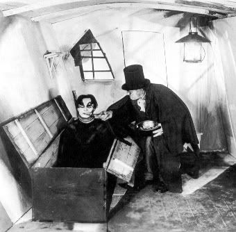
It seems to have been a heavy influence on the likes of Tim Burton, in the lecture it was linked to 'Sleepy Hollow', but a last night I watched 'Sweeney Todd', and there were clear links between the two. For example, the main characters wear heavy make-up, which I would see as a visual decleration of emotion and mood. There are other ways in which both films accomplish setting mood - they both show certain scenes in different tints of colour, i.e. Sweeney Todd has scenes set in the past where the screen is much brighter and colourful than compared to the consistent grey and dim colour throughout the rest of the film. Dr Caligary has scenes where the screen is tinted a certain colour or tone to help establish mood - i.e. some of the flashbacks were in a sepia tone rather than the standard black and white used throughout the film.

Of course, there were links to other Tim Burton films, the likes of 'Corpse Bride' could be related because of the abstract theme, in The Cabinet of Dr Caligari many objects such as roofs form pathways, which clearly happens in Corpse Bride also.

There were some other techniques that I noted down; the film is shot from a first person narrative which for it's time would have been something else. It was the first film ever to start with a flashback, it seems to have been quite the trend setter as it used a lot of brand new techniques for its time. It is a German expressionism film - because of the mise-en-scene; so the sets and decor, also the light, shadows and patterns of object are all painted onto the sets. There were a few more techniques that were noticable, such as authority figures being seated higher than the general public, which i felt was an effective way of showing stature. The frame was controlled very well, it was clear where the audeince should have been looking at all times, which was important as the shots didn't move, they had to be framed perfectly.

Wednesday, 26 November 2008

The Rule of Thirds


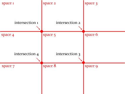
The Rule of Thirds breaks images down into 9 sections, intersections are created where the sections cross over - creating 'hot spots' - which is where the main action of the image goes. Using these 'hot spots' creates a more interesting composition. None of the sections should be completely empty, but they should be so full as to take the attention away from the intersections.

Below is a short video showing how the rule is applied in cinema, the scene is from the film 'Crank', notice how the main action occurs within or around the intersections:


Tuesday, 25 November 2008

Photo Edit

I have changed the colour of the bananas from yellow to red, making them an abstarct colour makes the image stand out a lot more, partly because bananas aren't normally red, but also because the colour is a lot warmer, i.e. exciting and bold.


In the second image I have changed the door colour from blue to pink, this is to represent the room being occupied by a girl.

Monday, 24 November 2008

Figuring Light: Colour and the Intangible

http://i398.photobucket.com/albums/pp65/EhGoonieGoogoo/NTU%20Journal/IMG_9175.jpg

Love More by Rebecca Partridge


This image is bursting with contrasting colours, but they contrast more in the centre of the image as this is where the brightness or darkness of the colours is most dominant, the colours fade gradually towards the edges. There isn't a dominant colour, or colour variation so its difficult to determine the meaning of them. However, taking into account the title (Love More) I would expect red to show some dominance, but I would assume its deliberate that it doesn't, I think the artist is trying to show that love isn't as simple as one emotion or feeling, but a combination of many or even that you can't have love without other emotions, and as the colours contrast it suggests that maybe love is made up of contrasting feelings, such as both love and hate.
The colours show more warmth in the centre, and this is where the audience's eyes are initially drawn to, warm colours convey excitement, so the first perception of the image is enticing. As you look at the image for longer the cooler colours become more prominent, and so the image loses its opening interest.
Overall the image uses the colour spectrum well, and at first glance the image looks like its bursting out at the audience, which is exagerated by the use of colour - changing the hue and saturation as the colours are closer to the edge of the image.


I came across the problem of not being allowed to take pictures of the artists work, just in case anyone else had the same problem here's a bunch of links with most of the exhibition artwork on them:

Rebecca Partridge Richard Kenton Webb Duncan Bullen

Unfortunately I couldn't find anything on Jane Bustin, if you find anything I'd appreciate it if you let me know, thanks.

Sunday, 23 November 2008

Understanding Design Methodologies


Why is it that we want our belongings to do more for us than to function well?
I own a variety of guitars, some simply for the aesthetic value, others for the way they sound, however I feel that this guitar carries both qualities of sounding good and being eye catching. I don't think its enough anymore for our possessions to function well, we always want more from the things we own, and this is partly down to our consumerist life styles and social pressures. For example, new mobile phones are constantly being made and sold, not because their predecessors no longer function well, but because its not enough to function well, visual design is as important as how well an object works now - and I know this is true as I wouldn't have purchased my guitar if it didn't look exactly like it did.

Why are we willing, as soon as we can afford it, to pay extra for things with appealing forms?
Consumerism. We want things that look nice, which don't necessarily function well, i.e. I could have bought a better functioning guitar than the one above for the same price, but it wouldn't have had such an attractive design - and truth be told if I had looked elsewhere I could have bought it for cheaper, I saw it, loved it, then bought it - without looking around first. Buying on impulse happens a lot, which is why so many things have attractive designs over function.


Monday, 27 October 2008

Reading and Reflection: The New iPhone

Reading and Reflection: The New iPhone
(491 words)

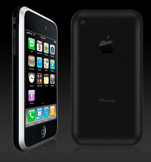
In 2007 Apple’s iPhone debuted, and it was revolutionary in the world of mobile phones. It carried the same concept as so many phones before it, which was to integrate various multimedia features into one gadget, as well as keeping it as a phone, and it did just that but in a way we‘d never seen before.
The original iPhone had a 2 mega pixel camera, a built in iPod and either an 8GB or 16GB memory capacity, depending on how far you wanted to stretch your wallet, plus all the features you find on a standard phone, calculator, alarm, games etc. However, none of these features really stood out, the only thing that did was its touch-screen capabilities, and the popular ‘YouTube’ feature - but since then the likes of the ‘Tocco’ from Samsung have been developed, which could do whatever an iPhone could do, other competitors have also introduced phones with similar capabilities, such as LG’s U990.
So now we have the new second generation iPhone, but its unlikely that it will have the same impact as the original. It doesn’t offer anything groundbreaking, touch screen has been done, and the other features remain practically unchanged. The main new features consist of a full internet browser, which means no more mobile internet, the interface is the same as you would see on a Mac, and its fast too as it has 3G connectivity, although these features are new to the iPhone, they‘re not new to the Mobile world, other phones offer the same technology. However the iPhone has been able to brag for sometime that it has a Mac based OS X operating system, and until recently very few phones compared to that, the Nokia N95 was first to with its Windows Mobile operating system, but on its way now is the ‘Omnia’ by Samsung. It has an improved version of Windows Mobile, its touch screen, and its specifications and features match that of the new iPhone, if not beating it in some areas, for example, it has a 5 mega pixel camera. Omnia also has a full internet browser and 3G, like the iPhone.
But despite the competition and the lack of new features the iPhone is still likely to prevail above competitors because its appealing to consumers, it looks nice, it’s a status symbol and it’s the gadget to have at the moment. Of course because they are so sought after they’re more likely to be a target for thieves, much as iPods were a few years ago when they were the gadget to have.
So is it worth the money? It’s a guarantee that in around 6 months time the iPhone’s specifications wont be worth what’s paid for them now, and apart from the fact it now has faster unrestricted internet, its virtually the same as the first generation iPhone, so the impact on society is likely to be small.

Wednesday, 8 October 2008

.. "what do you want to get out of the course in addition to passing?" ..

most importantly a great understanding of the multimedia course and how it will direct my creative ability. i think its going to be a good opportunity to build on what i already know, hence why I'm taking it, but also a lot of fun.
.. "what did you get upto in the first week?" ..
I've been told to keep this clean as its a public thing, and i probably should for my own good, but I've got up to some right wacky bonanza over the last few days.. to put it lightly. i declared war on my liver and kidneys Friday night, I've been bombarding them with far to much drink, I've got a five day hangover and a booming headache, but it's all good. but I'm not drink mad, honestly.
i moved in on Friday and met my housemates, they're all cool. our washing machine doesn't work and we don't have a fridge, goooood times.. I'm not sure how this thing is monitored, so i wont mention the collection of road signs that I've got since Friday, or the amount of ATM machines that I've covered in American style mustard from that burger stand not to far from the SU.. :D
sorry for the shoddy typing (if there is any)